

Contact page design: best practices and examples
Apr 10, 2024
Your homepage is the most important page on your website. It's often the most visited by new and returning users, playing a major role in your website experience. Yet, deciding its content can be tricky. It's easy to overload with information, replicate content from other pages, and miss your target audience's needs.
The objectives for your homepage should be to:
To achieve these objectives, combine these six elements.
What should I put on my homepage?
Every website should have these six essential components on the homepage:
- Value proposition and messaging: what you do and who you do it for in your brand tone of voice.
- Target keyword: the word or phrase that you want your business to be found for.
- Differentiation: why a customer should choose you over other solutions.
- Proof: evidence that you can do what you say you can.
- Brand application: a consistent look and feel that reflects your brand.
- Call to action: ways for your visitor to convert or continue their journey.

When a new visitor arrives on your homepage you only have a few seconds, and therefore a few words, to engage them. That means finding the most effective way to communicate your value proposition in a way that's easy to understand at a glance.
When communicated well, your value proposition should combine the problem you solve, who for, and your brand's voice. It's about confirming that you can help the user with their problem, while also showcasing your brand. This removes any doubt about what you do and lets the visitor connect with your message instantly.
When you're crafting your value proposition and making it shine through in your homepage copy, make sure you're clear, honest, concise, and engaging.
Don’t be afraid to change, update, or test your value proposition statement using a tool like Wynter.
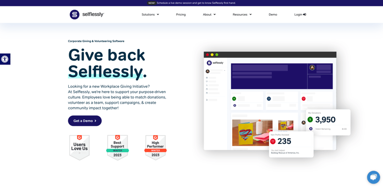
Selflessly effectively merge brand messaging with their value proposition. The headline clearly outlines the product's purpose, supported by a straightforward overline (the small text above the main heading), telling you in no uncertain terms what the software is. The body text explains the platform's functions and its positive impact on teams in more detail.
Another great example is from BCAS, who clearly highlight their specialism. The brand message is cleverly woven into the page's hero and body, acknowledging the complexities of the crypto industry and highlighting BCAS's role in guiding their customers.
.png?width=3548&height=1730&name=bcas-website-messaging-min%20(1).png)
Crafting the perfect message can sometimes lead to overlooking how people actually find your website - primarily through search engines. Your website needs to cater to those familiar with your brand, as well as those unaware of your existence who are searching for solutions using relevant keywords.
Your homepage could rank well for competitive, buyer-intent keywords, so it's important to factor keywords into your homepage planning. The keyword you want potential buyers to associate with your business should be the main focus of your homepage, prominently featured in the H1, meta description, as well as sub-headings and body copy where appropriate and natural.
Here's an example from Power Framework. Their target keyword is Microsoft project portfolio management software in their H1, but have styled it to look like a hero body copy.
.png?width=3544&height=1666&name=powerframework-keyword%20(1).png)
In this example, life science marketing agency, Biostrata, include the keyword life science marketing services in their H1. Combining their value proposition, messaging and keyword into a single, bold title.
.png?width=3528&height=1712&name=biostrata-keyword%20(1).png)
While your value proposition may have got your visitor to stay past the 'blink test', they are still looking for signals to help them decide if they should stay or go. To keep their interest, and their visit going, tell them why you're better than any alternative - your differentiation.
Differentiation can be conveyed in many ways. The most important thing, however, is that it's real and sets you apart from your serious competitors. Remember, points of differentiation aren't only found in your product or service. They can also be found in other areas of the value chain such as your customer experience, culture, organisation, or the way in which you meet the needs of specific users.
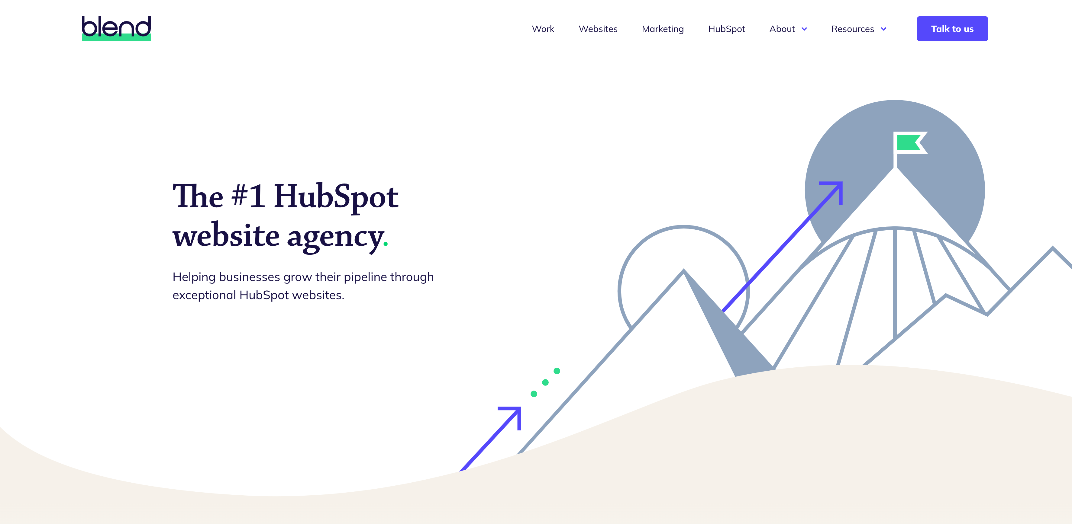
On our homepage, we set ourselves apart as the #1 HubSpot website agency - a proven distinction that differentiates us from competitors.
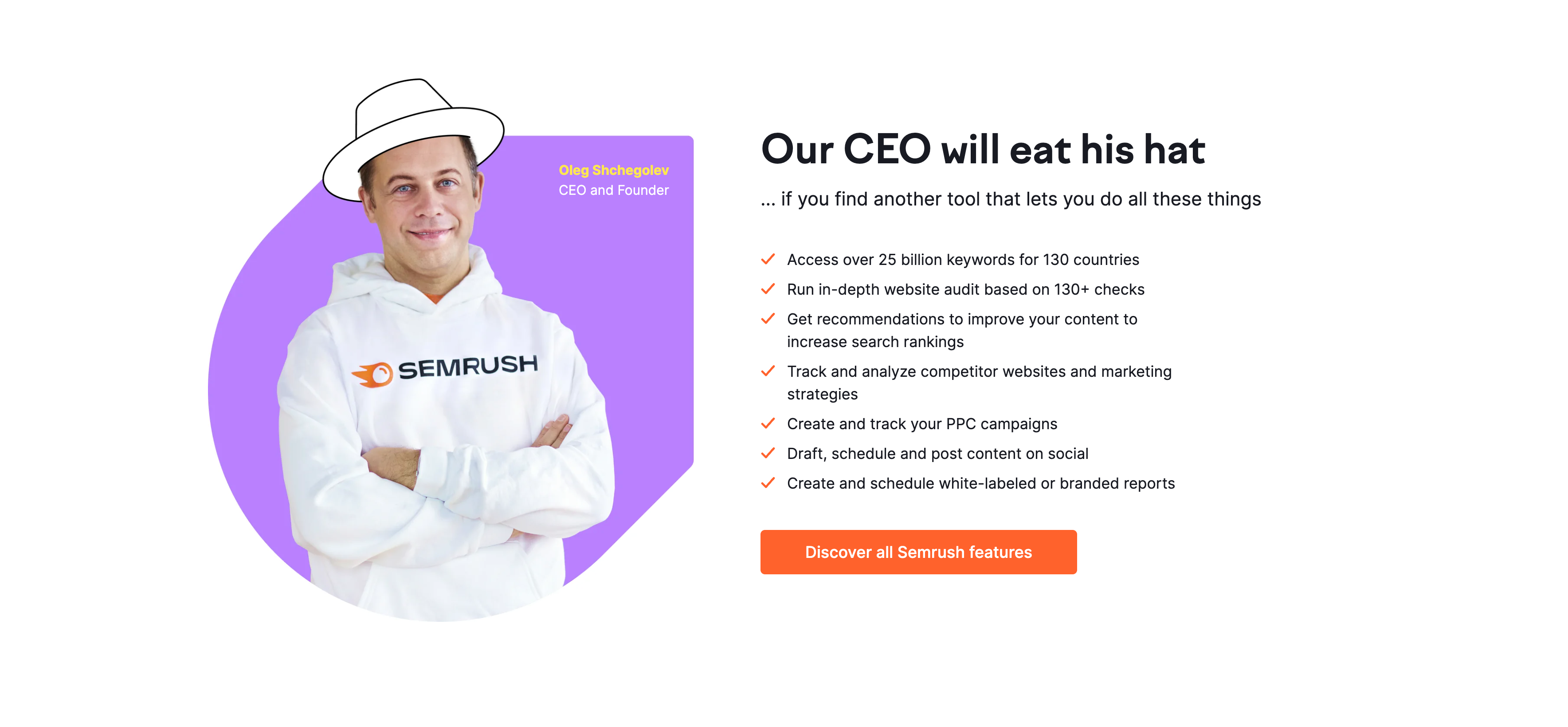
Semrush stands out with a bold and humorous approach. They differentiate themselves by asserting their tool's superior functionality compared to competitors. They playfully emphasise this by stating that even their CEO would "eat his hat" if you come across another tool with equivalent features.
By providing proof that you can do what you say you can, you can reassure and convince visitors to convert. In B2B buying, proof plays a particularly important and valuable role, helping buyers de-risk and justify their purchase decisions.
The easiest and most widely used way to communicate proof (although there are others) is to show customer logos, testimonials, or case studies. If you can source these, use them.
Here's a great example from Cognism. Their homepage is packed with proof in lots of different formats to build trust and confidence with visitors. On their homepage, they use a combination of signals such as the number of businesses that use their product, some examples of companies they work with, and case studies to de-risk buying their product.
.png?width=1828&height=1736&name=cognism-proof%20(1).png)
Wynter also has multiple forms of proof on their homepage, but notably, they use a range of testimonials to humanise their customers and make them feel more relatable to website visitors.
.png?width=3514&height=1730&name=wynter-testimonials%20(1).png)
Ensuring your entire homepage flows cohesively is essential. Users should experience a consistent journey as they navigate through it. Sometimes, homepages can feel disjointed with varying designs as you scroll. For instance, a bold, angled hero section might not match a rounded, soft design below the fold.
When designing your homepage, it's important to think about strategically integrating your brand into every element. This approach creates a seamless journey that truly reflects your brand's image.
Take the Datel website, for example. They incorporate their brand's distinctive red square, which is closely associated with their business throughout the homepage, serving as bullet points, button backgrounds, and even visual cues within illustrations.
.png?width=1541&height=2344&name=DTL%20Website-1%20(1).png)
Acre Security also do a fantastic job of applying elements from their brand throughout their homepage. Their unique gradient is used in imagery and section breakers and the unique logo shapes are reflected in iconography, providing a seamless experience.
.jpg?width=1200&height=933&name=8_pages-2%20(1).jpg)
Calls to action (CTA) play a vital role in directing people towards your website's ultimate goal. When it comes to homepage CTAs, the key is to position them in logical places. For example, the website navigation is the most effective and user-friendly spot. Visitors instinctively look there for their next move, ensuring easy accessibility.
Regarding the offer within these CTAs, they should align with your website's objective. We recommend focusing on clear, high-intent conversions, such as:
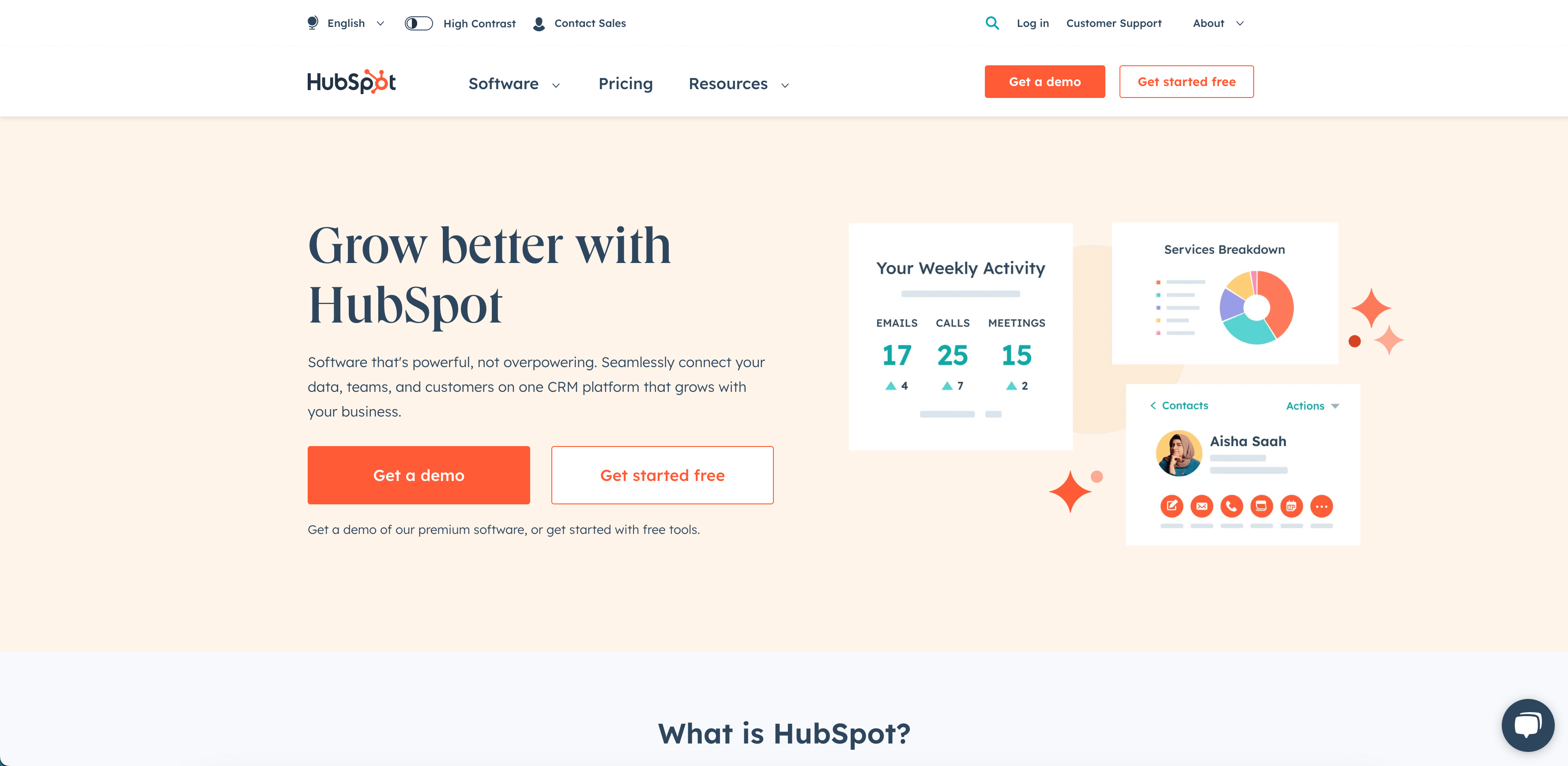
HubSpot has two clear CTAs so the visitor can choose to try the platform out for themselves or book a demo with a HubSpot sales rep. These are presented clearly in a sticky navigation.
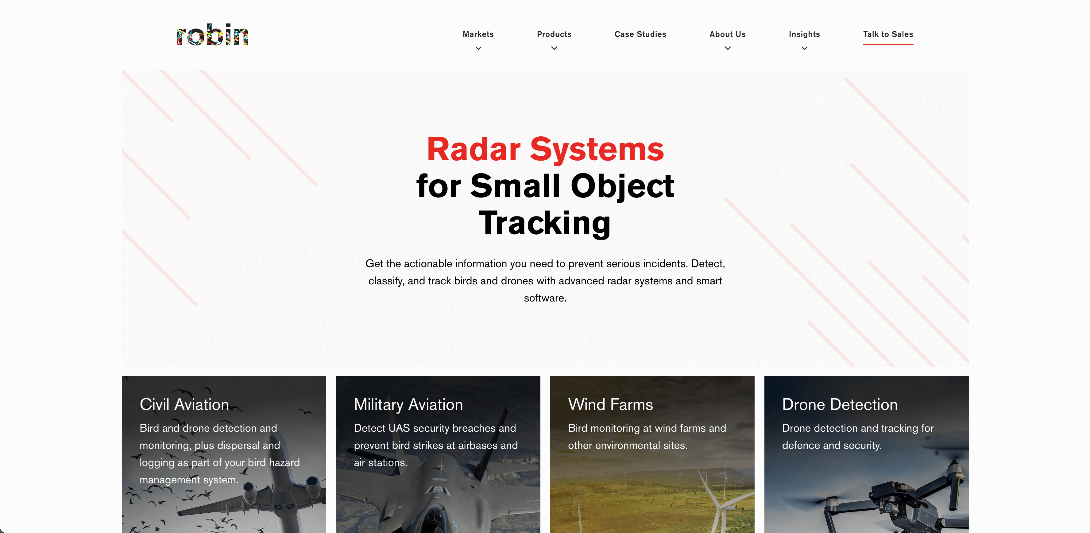
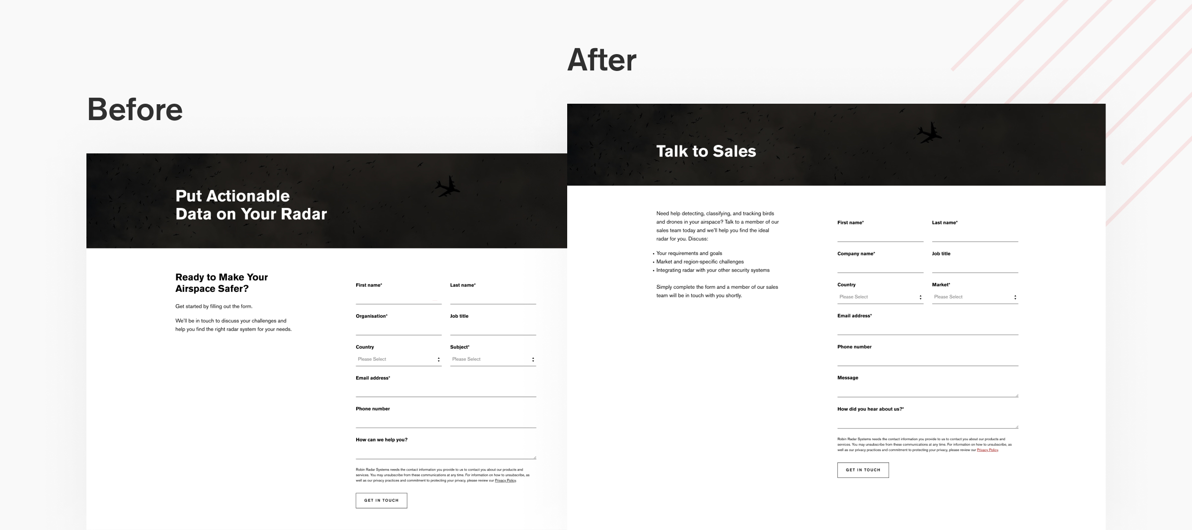
Robin Radar discovered the advantage of using clear CTA language that truthfully reflected their offering. After changing their CTA from a distorted message to a distinct 'Talk to sales' they saw conversion rates on their enquiry form increase by 10%.
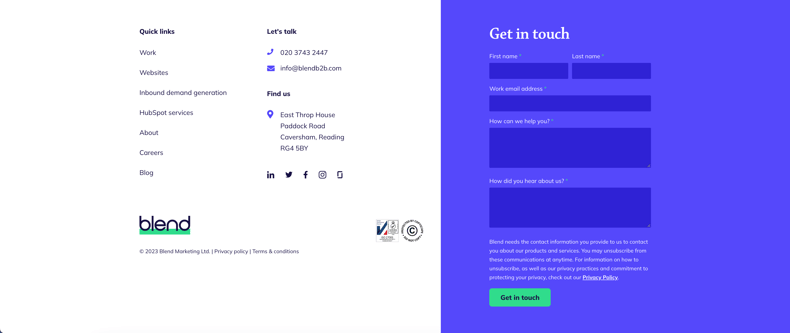
Using footer contact forms on our website and for clients has led to substantial improvements in conversion rates. It lets users seamlessly continue their journey on the same page, reducing friction.
A strong homepage serves as the foundation for a successful website, but the journey doesn't stop there. To create a website that consistently generates pipeline, you must ensure the entire site is working together to effectively attract, engage, and convert visitors.